
Lindsay Francis Brambles
Step-by-step: Atomagirl -- a pin-up style poster


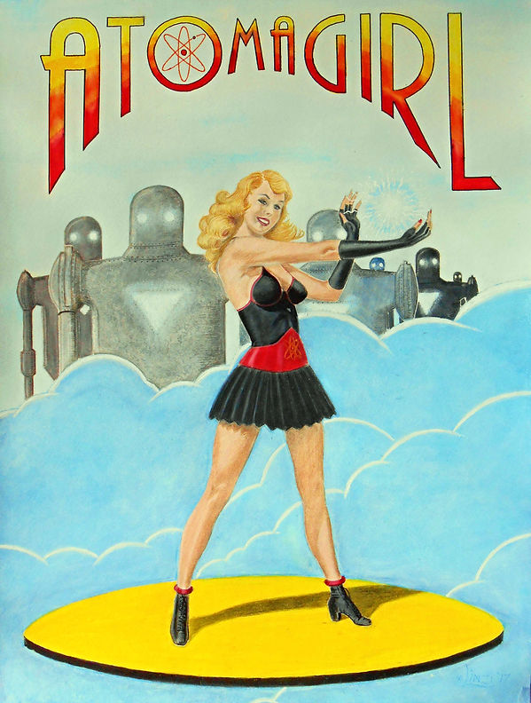
ATOMAGIRL AND THE GIANT ROBOTS OF DOOM is a throwback to the Golden Age of comic books and is part of the Jennie Canuck universe. In the case of the latter, I envisage an alternate history 1940s Earth, still prosecuting World War Two, but with sci-fi technologies popularized on the covers of SF pulp magazines of the thirties and forties. Hence the giant robots.
As with the other posters I have been doing in this series, they are all in the pin-up style that was revised and subverted by DC Comics Bombshells comic book series. In that latter the costumes are no longer about male objectification of the female body, but seen rather as a statement of ownership by independent, intelligent, and empowered women embracing their sexuality as a strength and not an exploitation or weakness.
Like many a superhero, Atomagirl has come by her powers by way of an accident – in this case an incident at the Chalk River Nuclear Laboratories (in Ontario, Canada). Once aware of her new found abilities, Atomagirl takes on all evils at hand – including the Nazi scourge threatening the world of the 1940s. In the course of her adventures she meets and teams up with Jennie Canuck (and others), forming an alliance that helps turn the tide of the war.
The Atomagirl poster is a mixed media piece, rendered in colour pencil, watercolour and acrylic paint, pastel, and watercolour marker. The work measures 45.7cm X 61cm (18in X 24in) and was done on Canson Watercolor paper (300g/140lbs). Prismacolor Premier Color Pencils, Artist’s Loft Dual Tip Watercolor Markers, Reeves Watercolor paint, Crayola & Grumbacher oil pastels were among the art supplies used to render the picture.
For a speed art/time lapse look at the creation of the poster, see the video section of this site, or see the video on YouTube.
The Step-by-step

This is the rough doodle that started it all. A very quick sketch to figure out the basic premise of the poster.

Using 2H and 4H pencils, the figure is sketched onto the watercolour paper. I always start with the face, because if you don't get that right you might as well not carry on.


Once the entire poster is sketched, the colouring begins. I generally start by putting down a base of highlights using white pencil.

Once the highlights are set, flesh tones are added.

Details are coloured and blended in on the face -- eyes, lips, shading.

The same process used on the face is extended to the rest of the exposed flesh of the figure. The colour pencil layers are blended using a Prismacolor blending pencil.


The flesh areas are practically finished at this point, with just some minor tweaking left to do.

The hair is coloured using various shades of yellow, burnt ochre, black, and white.

A base of black colour pencil is laid down for the costume.

At this point the black has been blended, but there are still some highlights to add -- as has already been done on the gloves. I layer white over the black and use the blender to get this effect.

Some watercolour marker is used to make stronger shadows on the black costume.

After a layer of red is laid down and blended, white is used to make highlights and give the effect of polished leather.

At this stage the figure is almost complete. The Atomagirl symbol is added to the belt and her boots are coloured and blended.

Laces and eyelets are added to the boots using the fine end of the brush tip on a black watercolour marker.

The base yellow for Atomagirl's flying disk is added using yellow colour pencil.

Once the disk has been coloured and blended, the edge is finished using black watercolour marker.

Atomagirl is now basically complete, and all that remains is to finish the background.

A blend of blue and white watercolour paint is added in a thick layer. Overtop this is added white pastel which is blended using a brush and some paint thinner. This gives the clouds a feeling of more depth and weight to them.

Highlights are added to the edges of the clouds using acrylic paint. I was not going for realistic clouds here, but rather a more comic book aesthetic.

With the clouds done and a thin wash of blue for the deeper background, it's on to the giant robots. There is not a lot of detail in these, and they're meant to reflect the pulp era SF themes of the 30s and 40s.

Continuing with the robots, blending the base layer of each one.

Once the robots have been coloured and some details have been added (rivets, shading, highlights, etc.), I use a stiff brush and a dry brush technique to give the eyes and chest windows a radiant glow using a mix of blue and white paint.
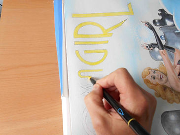
The base yellow for the lettering is laid down using yellow brush tip watercolour marker.

The final stage of the ATOMAGIRL logo is laid down using more brush tip watercolour markers. Red and orange are added in separate bands overtop the yellow.

After the separate colours are in place on the letters of the logo, they're then blended using a brush and water, bleeding each colour into next.

The completed ATOMAGIRL poster. (It looks better in person; the camera tends to wash out some of the colour a little.)